Heatmaps are an absolutely critical tool for understanding how users interact with your site. Small changes to a site can make a big difference and heatmaps are one of the tools that can provide useful visual data to understand how effective your design really is. Last week we were analyzing the new design of Kayaking.org that we launched later in 2011 to understand how well it was working. We’ve seen some incredible results from this design but still some areas that definitely need improvement.
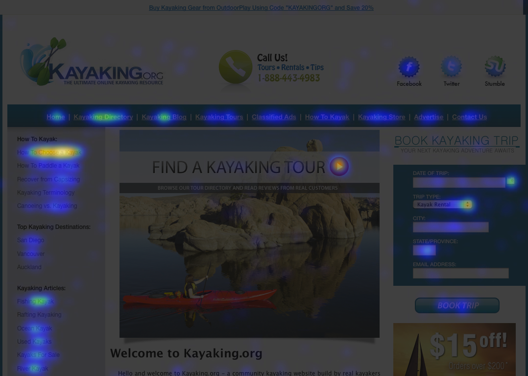
So let’s take a look at the heatmap and go through the good, the bad, and the ugly:
 (Click image to see full size)
So first, let’s start with what was working. Based on data from the previous version of Kayaking.org we found that the most popular portion of our site was information about choosing a kayak. To maximize our impact based on this information we reached-out to a professional kayaker to put-together a really solid article about choosing a kayak and we put it at the very top of the sidebar. As you can see from the Heatmap it’s definitely getting a lot of attention and it has made a nice impact on the average time a user spends on our site.
Our new booking engine is also seeing some good traction and the heatmap show the attention this gets. Looking at the sidebar and the top navigation you can also see which categories are the most important and we’ve worked hard to get our most popular topics above-the-fold, but we’re always tuning!
Okay, that’s the good, now for the bad. With the relaunch we really wanted to highlight a new central slider that we hoped would feature some of the most popular things visitors were looking for. Unfortunately, looking at the data behind the heatmap, the slider only receives 5% of the clicks. The “How To Choose A Kayak” article is actually getting more than double the slider with 11% of the total clicks. When we see something like this, we tune!
So last week we made several changes to the central slider. A lot of the tuning we do is based on some of the great insight provided in Tim Ash’s book – Landing Page Optimization, as well as some great blogs, and things I’ve learned at conferences like Affiliate Summit. There were a few things wrong with this slider so in tuning we made a few key changes:
- Add bright, distinct buttons that grab the users attention – before the tiny red button at the top didn’t really capture your eye and it blended in a bit too much with the image. We replaced this button with electric blue buttons accented by a feathered white background so they really pop.
- Change The Slides Based On Current User Behavior – we know choosing a kayak is big, but we also wanted to add more shopping-related options as this area has been a growing revenue source for our site. One of the most popular products we’ve ever sold through the site is the Go Pro HD Hero 2 which is an awesome waterproof HD cam that is very popular in the kayaking community. Finally, we have over 1,600 fans on Facebook and the interactivity we get is phenomenal, so it felt important to feature this as one of the main slides.
- Provide Special Offers When Possible – people like deals and exclusive offers, by adding coupon codes and discounts on the slides we are able to give people more of a reason to click and find-out more.
The new slider has been up for about a week and I’m excited to say that this central slider now receives 14.6% of the clicks, almost a 3x increase from before. Of course this process doesn’t end, it continues all year long. The more you can optimize your sites to deliver what your user is looking for, the better brand loyalty you will get, and the more conversions and revenue you will generate. We sold a $219 piece of kayaking gear from the first slide just two days after making the change so along with more interactivity we’re already seeing it generate some money.
In 2012 Kayaking.org hit the first page of Google for the insanely high search-volume term “kayak” which has driven over 1.8 million impressions on Google just this year driving thousands of new visitors to the site to start-out the year. The more visitors, the more data we get and the quicker we can tune the site and optimize the flow. So for any of the Domain Investors out there that have developed their domains and want to take it to the next level, give heapmaps a try, you’ll be surprised what our visitors can teach you about your site!
—
Oh and if you want to know what software I use for heatmaps it’s called CrazyEgg and it is easy to setup and very affordable. This isn’t an affiliate link, it’s the software I use myself and highly recommend for anyone that wants to dive-into the world of heatmaps.


